Rocket Mortgage offers playbook experience

alleviate production and time spent building offers on the design team and create a streamlined review process for future cases.
Role: UX/UI Designer
Design Team: Soo Yoo, Renn Jarrett, Kaitlyn Crigler (Content Designer)
Product Team: Andrew Ly
Tech Rep: Ashleigh Belisle
There were many reasons why the offers page on Rocket Mortgage Servicing needed a complete makeover, but these three gave us the immediate indicator to break this concept into features and into tasks.
So far every client sees the same offers.
Information Hierarchy is not clear on the page as to what type of offer is where within the page.
Too much content on an offer card itself. HMW simplify this while retaining details.
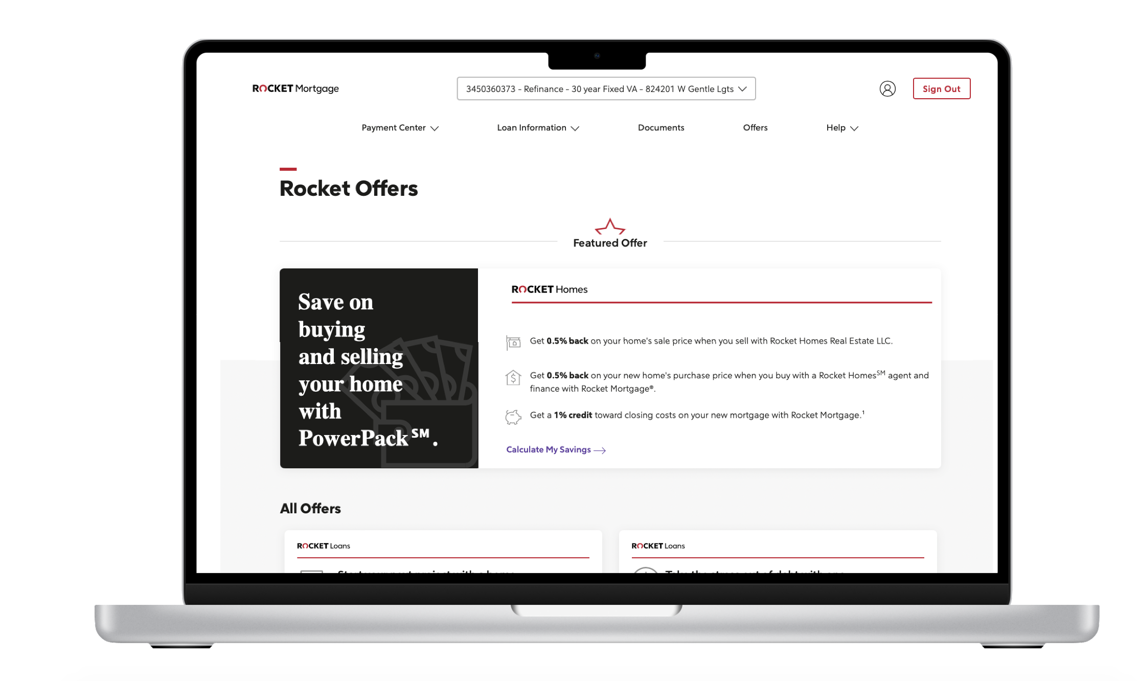
Before The Redesign
Start of The Process
-
Our Discovering Moment
We realized that clients struggled to find trusted resources, recommendations, and personalized solutions to their financial and home ownership needs in the market today.
The business didn’t have a clear path or method to present specialized offers to our clients. Some were presented with irrelevant offers or too many. What discovered was that we needed to approach offers as a service to RMS clients that benefit them, help with their home or financial goals.
-
The Defining Moment.
Personalization in Rocket Mortgage Servicing was ad-hoc in Adobe Target, using Excel files of client lists that quickly become stale and not usable in RMS proper.
We were not using a centralized source of data that included all the models and data elements from our consumer data platform and market intelligence within Rocket.
So we decided that we needed to have a playbook of artifacts that would speed up to market the offers Rocket had for their clients while making it personalized by presenting it at the right touchpoints within the clients’ journey.
-
Ideation Expands
Aligned with our touchpoint efforts, we produced a playbook that our stakeholders can reference and use as a guide to provide their offer details, types, the customer segment it will fall into, and how to handle submitting future offer needs and materials to use.
The playbook laid out the context, definition, and customer segments and decisioning of where an offer will surface, along with visual and content guidelines, and projected timeline expectations for deliverables.
Our goal is to help alleviate production and time spent building offers on the design team and create a streamlined review process for future cases.
First Step
Before we went into deciding what was needed in the playbook, we needed to understand the term “value” and the concept of what is an offer.


After understanding the definition of value in an offer, we got together to whiteboard out our thoughts and decisions which came up with this matrix to figure out what current offers and new upcoming offers will truly benefit our consumers (that gets a little wobbly).
Second Step
After we defined the term of what a value is for our servicing clients on our whiteboard we took it to Figma to jam and workshop for 2 weeks. Along with the workshop, I took the initiative in teaming with our design systems team to explain the idea that content in an offer card itself should also have its guidelines and be its own UI element. From our collaboration, the offers playbook was born.


Third Step
While we were Ideating on this playbook to be reviewed by our stakeholders and collaborators. I quickly designed a few layouts of what could be the new possible offers page. By teaming with a UX Researcher I was able to design a quick prototype and we were able to launch a quick user testing to ten participants to test the prototype and provided us their feedbacks.


Interesting findings were…
Users are expected to view a curated list of offers.
Users preferred the “bento box” layout over the “carousel” layout because it was the most effective design that allowed clients to understand and see at a glance offers available to them.
Users mentioned that they expected their accounts to be in a logical order to the categories of offers.
Users welcomed the popup survey at the initial launch because they realized their offer page was curated according to their answer, but realized no offers were ever hidden from them.
Highlights
#1 Improving information architecture and content design for the offers page

After analyzing the original contents, journey and layout of the offers page, we reorganized the information and created new sections. We made the experience more relevant by showing respective sections upon user selection. We also practiced progressive disclosure with collapsing advanced settings by default which would be backed up by data sets and audience segmentation from salesforce.
#2 Creating new UX patterns based on the existing components
For product consistency, we need to leverage the design components provided by our new design system within Rocket. In our use case, clients need to 1) select what segment they would fall under (purchase, refinance, or nurture?) 2) configure each filter type and user interaction through out their account to activate a dynamic offers page when landed.
We were looking for UX components and patterns that would deliver simplicity, clarity and easy scanaibility. To minimize the engineering effort, I explored several options based on the existing card designs, pills and layouts. The team voted on the direction of simplifying the layout of the page and condensing the the content on the cards.

#3 Designing with the goal in mind
Knowing what we would like to achieve ultimately, we designed and implemented the audience segmentation and dynamism in a sustainable way. With UX patterns ready to reproduce and grow, we smoothly added features and started launching each phase in sequence.

Impact
Both user and business will gain the information and experience to know their users by implementing flexibility and personalization to the users dashboard and account. Today what is being implemented are the simple card designs and presentation of products based on client relevancy.
Next Steps (Envisioning future iterations and fast follows)
Personalization of users Rocket account has improved a ton since 2019. However, the journey does not end. As a cross-platform account, the offers playbook artifact idea is expected to serve multi-function spaces and upcoming products for the business and serve well for various business needs. In the future, I would like to rethink the playbook artifacts as a marketplace template that will help drive production and minimize the cost of design, which will suggest the event cadence and provide room for next-steps and strategies. The playbook idea should not be limited to a single purpose, but have the ability to be customized for different use cases.
With the nurture team, I'll keep working on this playbook idea and collect customer feedback. If you're interested in learning more about this project, reach out to me and let's chat!
